ShopDreamUp AI ArtDreamUp
Deviation Actions


Suggested Deviants


Suggested Collections


You Might Like…


Featured in Groups


Description
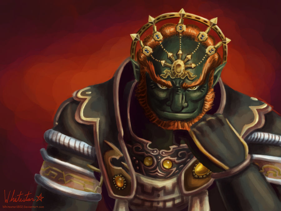
I would've had this finished yesterday, but I was distracted with a second project. But, here it is, my favorite incarnation of Ganon (visually). I just love this shot. It's like Ganon knows you're coming to stop him, but he just doesn't care enough to stop you.
I just love Twilight Princess' visuals so much. The designs are just awesome, the cutscenes superb, and the colors and environments are just gorgeous! I've started getting back into this game, so expect s'more fanart in the future.")
Refferenced this screencap: [link]
I just love Twilight Princess' visuals so much. The designs are just awesome, the cutscenes superb, and the colors and environments are just gorgeous! I've started getting back into this game, so expect s'more fanart in the future.
Refferenced this screencap: [link]
![[link]](https://www.deviantart.com/users/outgoing?http://zeldawiki.org/images/d/d0/GanonTP2.jpg)
Image size
1200x900px 1.15 MB
© 2012 - 2024 Whitestar1802
Comments60
Join the community to add your comment. Already a deviant? Log In
Very nice painting!
The face is done well. However, the left and right sides are not completely symmetric in your piece (some organic-ness is ok of course).
In this piece it is not a huge issue but I noticed the eyes are not completely level with each other, and there is a difference in the shape/size of each cheekbone. The left one is shorter and squat, the right one longer and thinner. The left one is shrouded in shadow of course which makes it harder to see, but the underlying difference in shape is still apparent.
The left eyebrow seems shorter than the right, as its terminating edge is more apparent, due to it being lighter. The right eyebrow seems to merge into the tuft of hair just behind it, due to the shadow between the two being very thin, and the values of the eyebrow and tuft of hair being nearly the same.
The attention to detail on the gemmed area just below the neck is very well done: the color choices and shading are very effective.
The white clothed area underneath it though (specifically the very bottom) seems to be less refined. I saw that in the reference pic the image cuts out, so perhaps you had to 'invent' that part. I think the brown lined pattern on that area is not quite symmetric.
Also, the two large gems which hang off the shoulder pieces are not symmetric to each other (factoring in the tricky perspective of course). The rightmost gem is adorned with elongated bean-like forms with minimal space between, whereas the left gem is surrounded by round forms, and more pronounced gaps. The right gem should be moved downward slightly as well, as it is placed higher on the shoulder piece than the left currently is (factoring in perspective).
I also noticed that on the upper sleeves, just before they are covered by the larger shoulder piece, there should be an interleaving striped pattern, which I saw in the screenshot. This may have been left out in your painting on purpose, or it may have been an oversight.
I noticed the edges in your painting all seem to be rather soft. This is ok on organic features and the periphery of the painting, but around the clothing trim the edges could be harder still in certain parts, and a little darker where occluded shadows would be present.
The left armband has some perspective and proportion issues, as the bottom silver ring is thicker than the top, and the reddish center portion does not curve outward with the raised tip on the top ring, as it does in the reference photo.
The crown on his head is nice, although it is a bit wobbly (not a mechanically drawn arc), with uneven and varying thickness. Not a huge deal in this piece, but something to think about for next time.
Overall, this painting has a *really* great use of color and shading. You have an eye for that for sure. The issues I see are mostly with symmetry, proportion and some edgework.
One quick note, I like the eyes, but from the other critique I second that if they were looking straight at the viewer, that would be a nice touch for this piece.